

Key Takeaways
- The arrival experience shapes patient confidence before the clinical visit starts.
- Shorter forms, plain language, and fewer repeated questions can reduce friction.
- Digital check-in should expand patient choice, not create a technology-only barrier.
- Privacy, accessibility, language assistance, and downtime procedures should be built into the design from the beginning.
- Teams should measure speed, errors, staff workload, and patient feedback after every major change.
The first few minutes of a healthcare visit can influence how patients feel about everything that follows. A confusing entrance, a long line, or a form that asks the same question twice can raise stress before care even begins. Organizations exploring better arrival experiences can learn more about patient check-in options while keeping the focus on a simple goal: make each person feel expected, informed, and supported.
A smoother check-in process does not mean removing people from the experience. It means using clear instructions, thoughtful technology, and visible staff support to reduce unnecessary work. The best designs give patients choices while helping front-desk teams spend more time on questions, exceptions, and personal care.
Why the Arrival Experience Deserves More Attention
Check-in transcends a mere administrative function, serving as a pivotal moment for patients to confirm their location, understand expectations, and begin to establish trust with the organization regarding their personal information. Ineffective check-in processes lead to repeated inquiries from staff, longer lines, and delays impacting rooming, billing, and appointment schedules. Key challenges include vague parking instructions, hard-to-locate departments, complex forms, redundant information requests, and uncertainty around submission statuses. Implementing small enhancements, such as a visible greeter, clear next-step communications, or accessible assistance options, can significantly improve the experience and avert initial frustrations without necessitating a fully automated system.
Start With the Patient’s Real Journey
Before changing screens or buying equipment, map the full journey from the parking area or entrance to the exam room. Include what patients see, hear, read, and need to do at every point. Watch the process with fresh eyes, because steps that feel obvious to staff may be unfamiliar to a first-time visitor.
- Find the correct entrance and department.
- Locate the check-in area or welcome desk.
- Confirm the appointment and identity.
- Review contact, insurance, and consent details.
- Complete required forms and signatures.
- Request assistance, an interpreter, or accessibility support if needed.
- Receive clear directions to the waiting area or care location.
Journey mapping often exposes avoidable uncertainty. Patients may not know where to stand, which device is available, whether their form was submitted, or how long the next wait will be. These details are the foundation of a practical redesign.
Build a Clear and Short Check-In Flow
A strong check-in flow presents one task at a time. It avoids lengthy paragraphs, unfamiliar administrative language, and buttons that do not clearly explain their purpose. Instead of “Proceed to registration verification,” use “Confirm your appointment.” Patients should always understand what they are doing and why.
Design Rules That Reduce Friction
- Use plain language and short instructions.
- Request only the information needed for that visit.
- Show progress when several steps are required.
- Allow patients to review entries before submitting.
- Explain what happens after check-in is complete.
- Keep a help option visible on every screen.
Offer More Than One Way to Check In
No single channel works for every patient. Some people prefer completing forms at home, while others prefer using their own phone, an on-site device, paper forms, or direct assistance from a staff member. Choice improves access and prevents the digital process from becoming a new obstacle.
- Pre-visit forms for people who want to prepare before arrival.
- Mobile check-in for patients comfortable using their own devices.
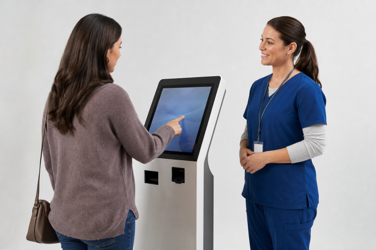
- On-site self-service for patients who need to complete tasks in the lobby.
- Front-desk assistance for complex questions or personal support.
- Paper or verbal alternatives when technology is unsuitable.
Keep Privacy Visible and Practical
Patients may be entering health, identity, insurance, or payment details in a busy public area. Privacy should be apparent in the physical setup and in the workflow. The privacy safeguards for protected health information serve as an important reminder that convenience should never outweigh the appropriate handling of sensitive information.
Position screens away from foot traffic, use privacy filters where appropriate, clear information automatically after each session, and limit printed documents that may be left behind. Patients should also have a private staff-assisted option. Explaining why information is requested and what happens after it is submitted can strengthen trust.
Design for Accessibility and Different Patient Needs
Check-in tools must work for people with vision, hearing, mobility, language, literacy, or cognitive needs. Use large text, strong contrast, reachable controls, clear text labels, multiple languages, and enough time to complete each step without an automatic restart. Digital forms should support screen readers and keyboard navigation where applicable.
The Department of Justice identifies clear instructions, labeled fields, and usable error messages as important parts of accessible forms. In a healthcare setting, the same principles help everyone, including people who are tired, anxious, in pain, or unfamiliar with the process. Staff assistance should be easy to request without making anyone feel singled out.
Use Technology to Support Staff, Not Replace Care
Technology can handle routine tasks such as appointment confirmations, demographic updates, consent signatures, insurance reviews, payment collections, and wayfinding. Staff should remain available for exceptions, billing questions, emotional support, and situations that require judgment. When basic data entry takes less staff time, teams can focus on the people who need them most.
Connect Check-In to the Larger Workflow
A polished screen cannot solve disconnected systems. Updates should reach the correct patient record, completed forms should be routed to the appropriate department, and authorized staff should be able to view relevant status information. Test the entire handoff before launch. A fast check-in that creates duplicate work later simply moves the delay elsewhere.
Prepare for Exceptions Before Launch
Reliable processes account for the unexpected. Plan clear responses for missing appointments, mismatched names or birth dates, changed insurance, incomplete forms, interpreter needs, restricted-area access, and device or network outages. Patients should know when and how to ask for help, while staff should know who is responsible for each issue.
Measure What Patients and Staff Actually Experience
Track more than completed check-ins. Review average arrival-to-completion time, forms finished without assistance, registration corrections, abandoned sessions, waiting time after check-in, and staff time spent on repeated entry. Break feedback down by visit type, language, age group, and location when possible. Numbers show trends, but patient comments and staff observations reveal why problems occur.
A Practical Rollout Plan
- Listen first: Ask patients and staff where confusion and delays occur.
- Map the process: Document every step from arrival through rooming.
- Start small: Pilot the new flow in one department or location.
- Keep human support visible: Make assistance easy to find at every stage.
- Test difficult cases: Include accessibility, language, identity, payment, and outage scenarios.
- Improve before expanding: Adjust wording, layout, staffing, and training using real feedback.
Conclusion
A better patient arrival experience is not defined by one device or software feature. It comes from clear steps, reliable systems, meaningful choices, privacy protections, and room for compassionate human help. When healthcare teams make the first five minutes calmer and easier, they create a stronger start for patients, visitors, and staff alike.